Dołącz do Social WiFi
Zacznij już dziś i zobacz, czego brakowało Twojej strategii marketingowej
- Wypróbuj za darmo
- Prosta instalacja
- 14 dni za darmo
Proste zasady, które sprawią, że Twoja strona logowania, emaile i proces zbierania opinii będą bardziej przyjazne użytkownikowi i gotowe do konwersji.
Strona logowania jest pierwszą rzeczą, którą widzi Twój klient. Jeśli wygląda chaotycznie, nieczytelnie lub jest przeładowana - użytkownik może po prostu zrezygnować. Dobry design powinien być intuicyjny. Nie chodzi tylko o estetykę, ale o to, by użytkownik bez wysiłku wiedział, co zrobić. Jeśli kiepski projekt zniechęca do zalogowania się do WiFi lub zostawienia opinii, mijasz się z celem.
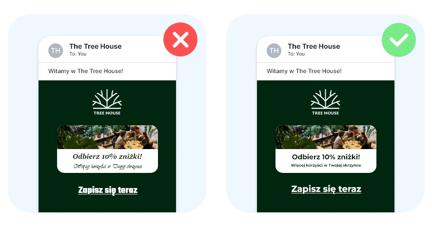
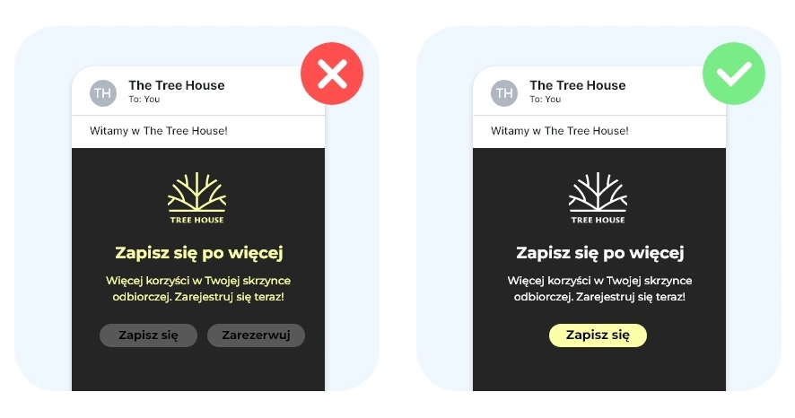
Nie próbuj mówić wszystkiego naraz. Jedna mocna wiadomość działa lepiej niż trzy słabe. Zostaw trochę przestrzeni - pomaga to oddychać projektowi i sprawia, że przekaz lepiej wybrzmiewa.
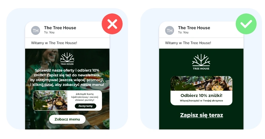
Unikaj umieszczania tekstu na zdjęciach pełnych szczegółów. Jeśli musisz użyć zdjęcia, dodaj ciemną nakładkę lub wybierz prostsze tło, by tekst był łatwy do odczytania.
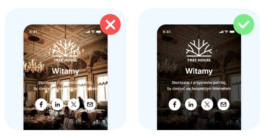
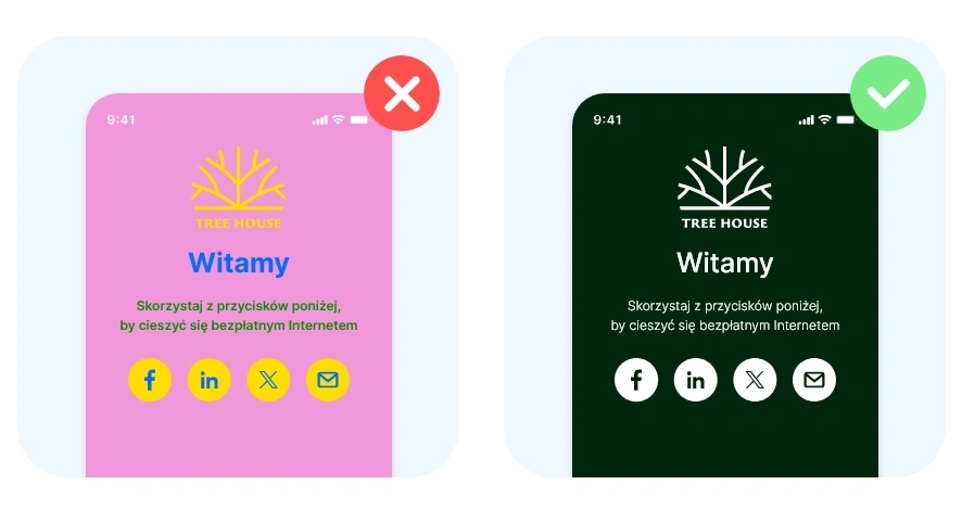
Zbyt wiele fontów wprowadza chaos. Jeden font do nagłówków i jeden (lub ten sam) do tekstu głównego w zupełności wystarczy.
Trzymaj się 2–3 kolorów spójnych z Twoją marką. Zbyt wiele kolorów męczy wzrok i rozprasza uwagę.
Najważniejszy komunikat powinien być najbardziej widoczny - większy, pogrubiony lub w kolorze. Mniej istotne informacje mogą być mniejsze lub bardziej subtelne.
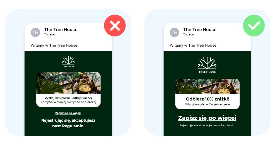
Przycisk typu „Zaloguj się” czy „Wyślij opinię” musi być widoczny. Użyj wyrazistego koloru i jasnego komunikatu. Unikaj wielu przycisków konkurujących ze sobą.
Nie projektujesz dla siebie, ale dla klientów. Projekt powinien być prosty, czytelny i intuicyjny. Jeśli masz wątpliwości, pokaż projekt komuś nowemu i zapytaj: „Wiesz, w co kliknąć?”
Zobacz, jak inni klienci projektują swoje strony logowania
Sprawdź najskuteczniejsze projekty mailingowe naszych klientów
Przeczytaj, jak duże i małe firmy odnoszą sukces z Social WiFi
Zacznij już dziś i zobacz, czego brakowało Twojej strategii marketingowej